Open to work

I'm available to take on freelance projects, whether it's building brands, crafting websites, or working as a user experience designer. If you're seeking expertise in these areas, get in touch!

Eline Case Study

Employee Onboarding App

Strategise and design an app that helps business owners onboard employees with ease.


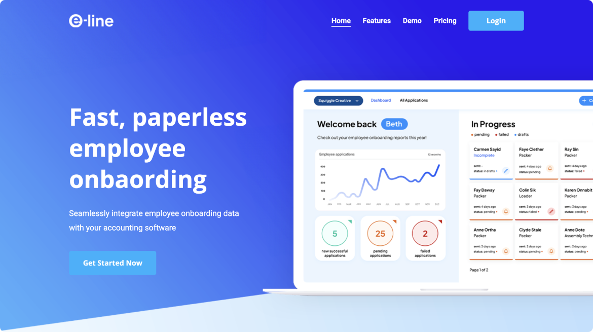
e-line generates its own employee onboarding forms and itegrates directly with accounting software, reducing the time spent on inputs.

Project Summary

Having spoken to my partner about staff onboarding and the monotony of re-writing employee data into accounting software, we thought that there has got to be a better way to improve this flow. This is where my partner and I came up with e-line, and employee onboarding app that integrates employee onboarding forms with accounting software.

  • Participation

    Self Initiated - Collaborative

  • Expertise

    Product Design

  • Duration

    1 week

  • Deliverables

    Design System, High-Fidelity Prototype, Promotional Website
Solution Preview

User Interface Refresh

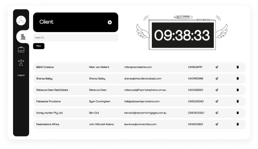
The primary challenge we faced was our platform's outdated user interface (UI), which many found unintuitive and difficult to navigate. This was evident from the recurrent training sessions we had to conduct for employers, as a significant number of them struggled to decipher how to send applications through our system.  

Image

Improved Application Flow

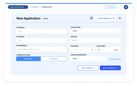
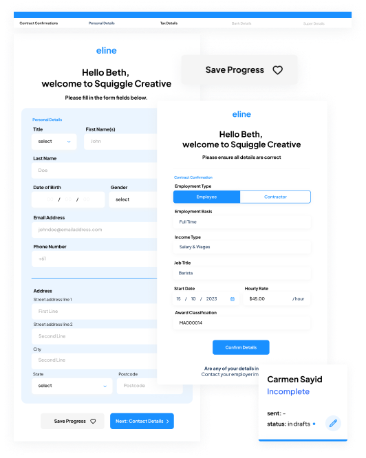
Employees frequently voiced their frustrations regarding the lengthy nature of the application, particularly the requirement to complete it in a single sitting.

Image

Promotional Website
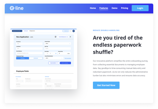
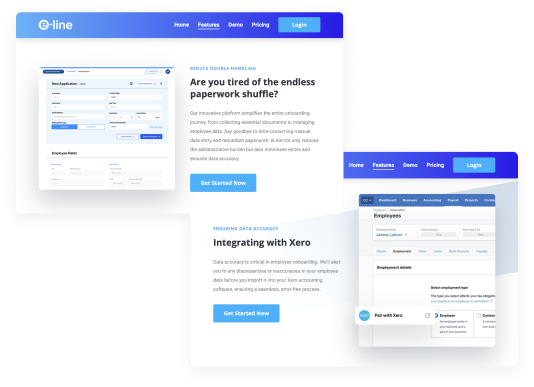
There were no digital products marketing this software, and therefore we needed to create a promotional website to push e-line out to new audiences. 

Image

Updated Design System in line with Xero

Lastly, in order for e-line to be listed on the Xero app store, our system needs to be in line with Xero's brand guidelines. An update to the e-line user interface is therefore required to meet Xero’s app store requirements. 

Image
Exploring Opportunities

Site Audit

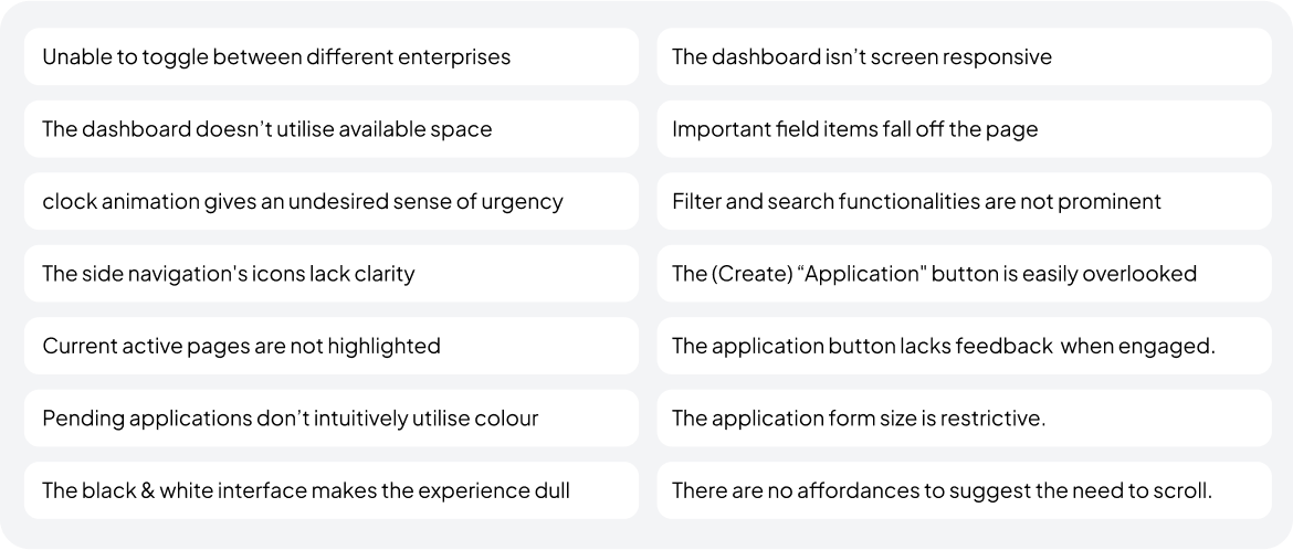
I conducted a site audit by assessing the current app’s visuals and patterns currently used across the platform to help identify areas for improvement and boost overall site functionality / user engagement.

Next Steps

The site audit pinpointed further areas of concern to be addressed in subsequent phases. My next steps include:


  1. • The software to support multiple enterprises and ensure seamless interactions across all.

  2. • Enhancing the create new application flow to optimise the experience for both users.

  3. • Revamping the UI to utilise space, show intuitive cues, and brighten up the overall brand presence.
Image
Design Challenge

HMW craft a more intuitive interface that seamlessly aligns with our users' goals and captivates new audiences

Design System

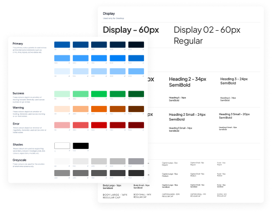
We adopted bright blue as our primary colour, lending a clean, professional and trustworthy feel to our interface. We also introduced status colours to enhance usability, allowing users to intuitively guage progress. Complementing the colours, 'Plus Jakarta Sans' sans-serif typeface was selected for its clean look and readability.

Image

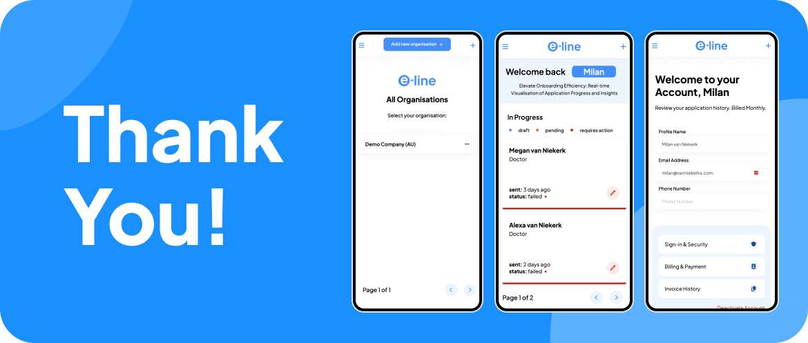
Status Bars

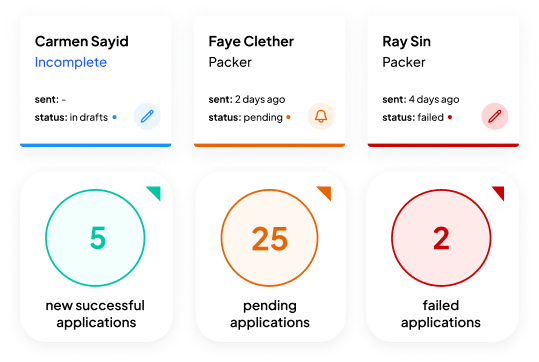
We've introduced distinct status colours to categorise applications into drafts, successful, pending, and failed categories, allowing users to quickly gauge the progress of their applications.

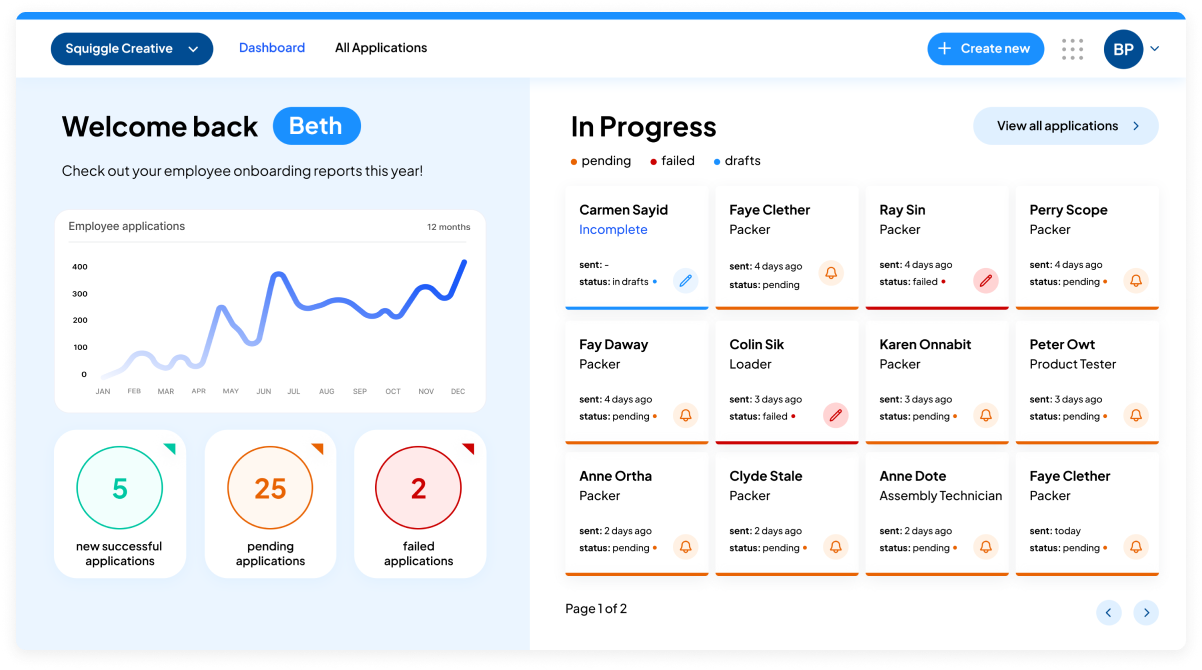
Recognising that "successful" applications no longer represent an ongoing task, we've made the decision to remove them from the main dashboard. Instead, we created a ‘new successful applications card’ to identify how many applications has been fed through to Xero.

Image

Utilising space

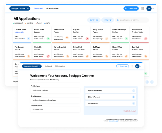
To enhance usability on our home page, we utilised the space by eliminating the clock icon, enlarged application cards for improved visibility, and introduced an "All Applications" page for efficient filtering. We also revamped naming conventions and icons to enhance intuitiveness in page navigation. Drawing inspiration from Xero's user-friendly dashboard, we replicated its navigation bar to create a familiar and consistent interface, streamlining the user experience and ensuring an intuitive customer journey.

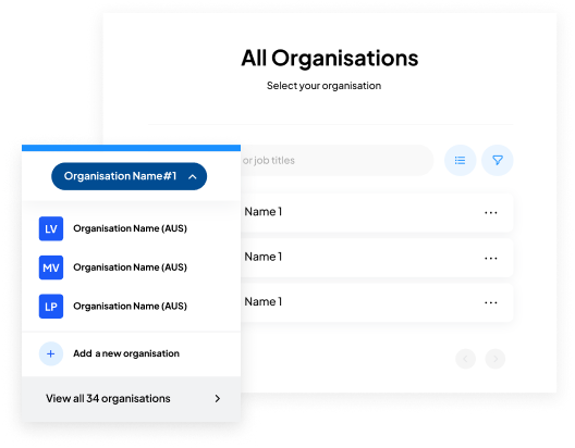
Toggling between enterprises

Lastly, we explored the possibility of enabling users to toggle between different enterprises, enhancing the versatility and functionality of our platform. We kept the same interactions and placement as Xero, as there was no need to reinvent the already well-defined flow.

Improving application flow

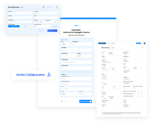
In our recent system enhancement, we've restructured the user flow to streamline interactions between employers, employees, and various managerial roles. By distinctly separating duties, we've made it intuitive for each user to identify which fields they are responsible for, thereby eliminating confusion about pending inputs. For instances where specific data might be lacking, accountants, owners, and business managers now have the capability to invite collaborators to fill in the gaps, ensuring that the process remains fluid and coherent.

Tracking & saving progress

To alleviate any potential overwhelm for employees navigating the system, progress bars have been introduced, providing a clear visual indication of the time ahead. We've also integrated a save feature, allowing users the flexibility to pause their input and resume at their convenience without losing any data.

A promotional website

I created a promotional website to showcase our product's standout features and value propositions. Central to our marketing efforts are the integration with Xero Accounting; a commitment to data security ensuring user trust; and paperless onboarding, which streamlines administrative processes and aligns with modern, eco-friendly business practices.