Open to work

I'm available to take on freelance projects, whether it's building brands, crafting websites, or working as a user experience designer. If you're seeking expertise in these areas, get in touch!

Shiftly Case Study

Short-Term Shifts App

Research, strategise, and design a job-search platform that helps travellers find flexible, short-term working arrangements in Australia.

Shiftly is a solution that helps connect employers with the travelling workforce.

Project Summary

Staff shortages have been a hot topic in Australia. The country currently has a 3.5% unemployment rate (one of the lowest in the world). Many businesses, particularly the hospitality industry are struggling to find staff to keep up with the needs of their business, yet, despite the demand, there is an influx of travellers online desperate for work and struggling to find employment. This is where I decided to self-initiate a project, where I can help connect employers with the travelling workforce.

  • Participation

    Self-Initiated

  • Expertise

    Product Design

  • Duration

    12 weeks

  • Deliverables

    UI Kit, High-fidelity Prototype
Solution Preview

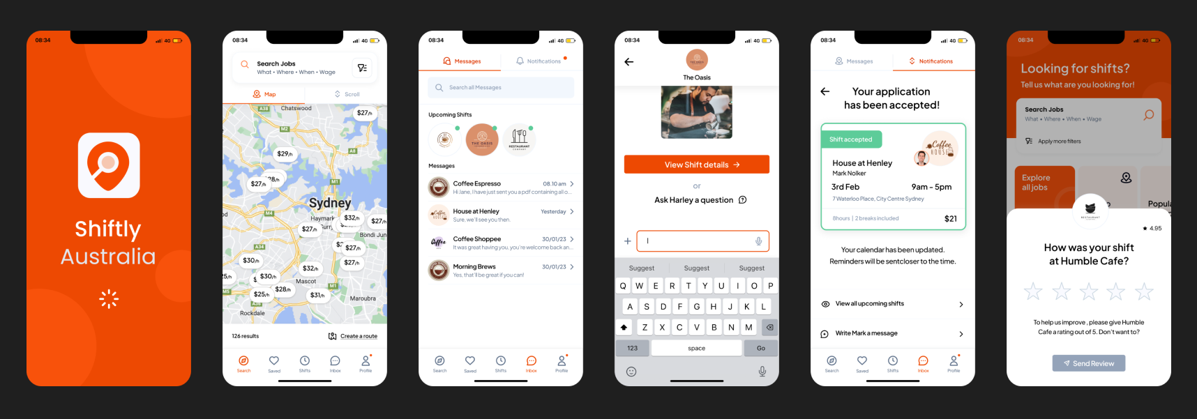
A ready-to-go app, accessible from your mobile phone.

Working Holiday Makers (WHM) have limited devices while travelling, they need a platform that’s 100% accessible on their phone to pick up and manage shifts any time, anywhere.

Image

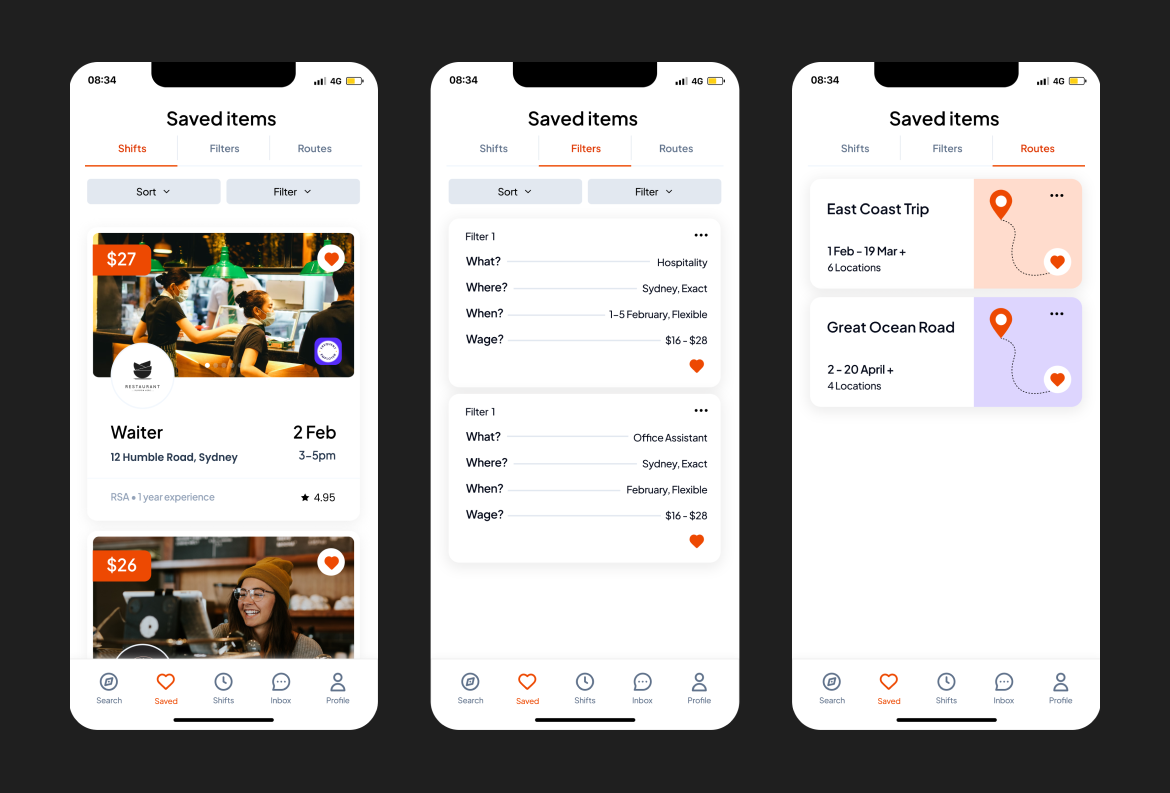
Browse and save short-term shifts in advance

Mongo DB’s no relational database provides flexibility and graphical storage capacity to store and retrieve filters to minimise time spent searching, picking up where you left off!

Image

Speedy Applications

Working Holiday Makers (WHM) don’t have the time to wait around for employer responses nor spend hours on short-term applications. They need to send off applications and receive responses within 24hours.

Image
Exploring Opportunities

User Interviews

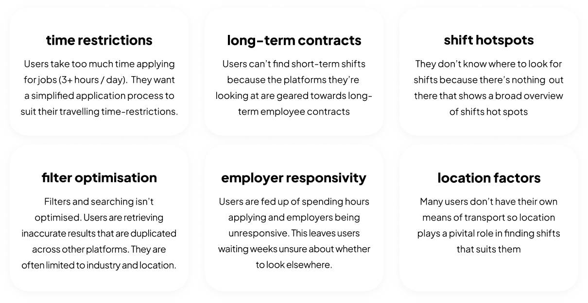
Interviews revealed 6 significant pain points

I conducted 16 interviews with job-searching working holiday makers in Australia, to find out some of our competitors, preferred devices, common pain points, and what they really want to see/ need. Below are some common pain points found in at least 80% of our users:

time restrictions, long-term contracts, don't know where to look, poor filters, lack of employer responsiveness, location limitations
Mobile friendly

Interviews revealed that 100% of our users use their mobile phones while job-searching, 30% may also use a desktop to send applications due to the complexity of writing lengthy cover letters and designing CV’s. 90% of my users were iPhone users while the other 10% were Android.

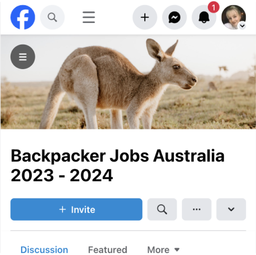
Facebook, a social media platform, was the primary job-searching competitor across all 16 interviews

Assuming my users were more inclined to use highly established companies, which offer an array of work opportunities world-wide such as Seek or Indeed, I wanted to hone in on speeding up applications and easing the flow. It was to my surprise that 100% of my users used Facebook as their primary job-search tool.

Image

Competitor Analysis

Identifying the competitors

Users competitors: Facebook, Indeed, Backpacker Job-board (identified through user interviews).
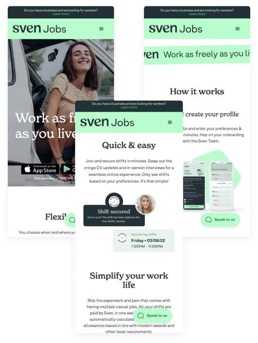
Market Research Competitors: Sven, Supp (short-term job-search applications in Australia)
Distantly related: Airbnb, Uber (similar business models)

I conducted a thorough analysis of key competitors, identifying their essential features through pluses and deltas.

My first instinct was to draw insights from existing applications and their current features. The aim of my analysis was to gain a deeper comprehension of these features and their arrangements, to prevent unnecessary redesign of workflows.

Image

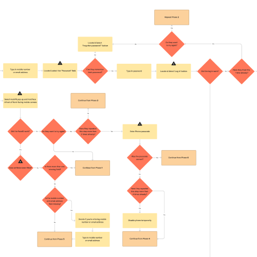
Facebook User Flow

User Flow

I chose to identify Facebook’s user flow because it is the preferred job-search platform among my users, but it also takes a casual approach to job searching and I was intrigued to find out what my users like about it. The key insights revealed from the user flow, in addition to the interviews with users were:

time restrictions, long-term contracts, don't know where to look, poor filters, lack of employer responsiveness, location limitations

Customer Journey Map

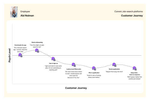
Research revealed that psych levels lower during:
  1. • Sign up before viewing content
  2. • Searching & filtering unpersonalised content
  3. • Time consuming application writing
  4. • Periods of no response from employer
Image

Who is our user?

I redesigned the persona as a reference point to keep my designs relevant, and to assess how they experience our competitors services keeping my designs user centric.
  1. • They wants a response, even if it’s negative
  2. • They value conversation with employers
  3. • They need shift locations to be accessible via Public Transport
  4. • They're organised and plan shifts ahead of time
  5. • Mobile is their device of choice
  6. • They get frustrated with paid highlights
  7. • They hate wasting time
Image
Design Challenge

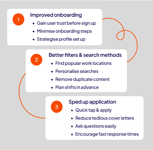
HMW create an app to improve the job-searching experience for travelling WHM’s in Australia, by focusing on time efficiency, personalisation and communication?

Design Opportunities

What might we need?

Referring back to my interviews, mobile, particularly iPhone, was the device of choice for all users. The primary reasons being they could search during down-time, and its harder to travel with desktops. In addition to mobile friendly design, I needed to consider onboarding, filters and speed of applications.

Image

User Flows

Having previously ideated some rough solutions, I jumped straight into some userflows to begin visualising and streamlining the process. I would ease this by mirroring previously successful applications, and building on top to optimise the journey.

Image

Information Architecture

In an effort to determine filter prioritisation and the optimal grouping and labelling of the global navigation system, I conducted two card sorts. These revealed insights regarding the content of the primary filter and the layout of the Shifts tab. However, during these sorts, overlapping areas, especially regarding business reviews and shift information, became evident.


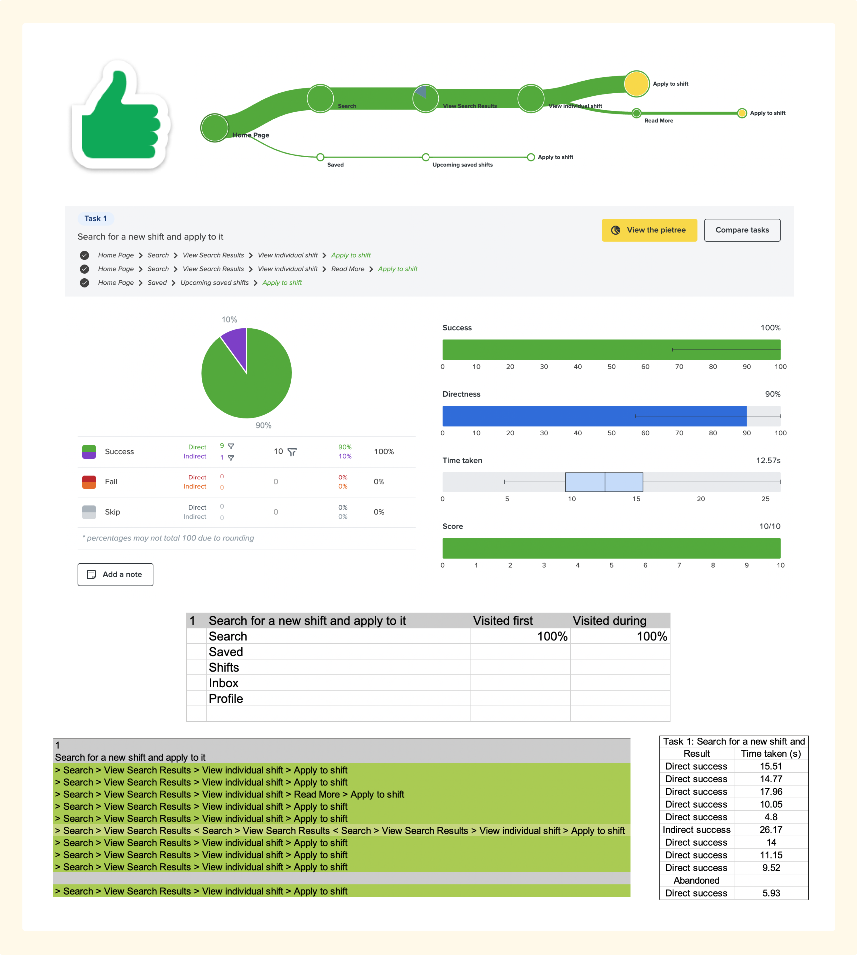
To mitigate this, I conducted a tree test with a total of 10 questions with 15 different users, covering all sections of the app to identify whether the new navigation system may require further changes.

Image

Results

  1. • Filtering by accessibility is either extremely high or no priority and should be placed in the primary filters, without overpowering other components.
  2. • Cancel shift was often made through messaging the employer. A cancel shift button should be accessible in read more section of shifts details.
  3. • Users wanted to leave a business review in the shifts navigation panel. A review button should be placed here once a user has completed a shift.
  4. • Users identified "badges" as qualifications. Qualifications should not be hidden, and should instead should prevail in profile navigation.
  5. • The naming convention ‘Work’ was inappropriate, and should be titled ‘Industries & Positions’ instead.
Image

Wireflows

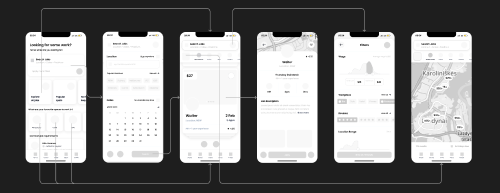
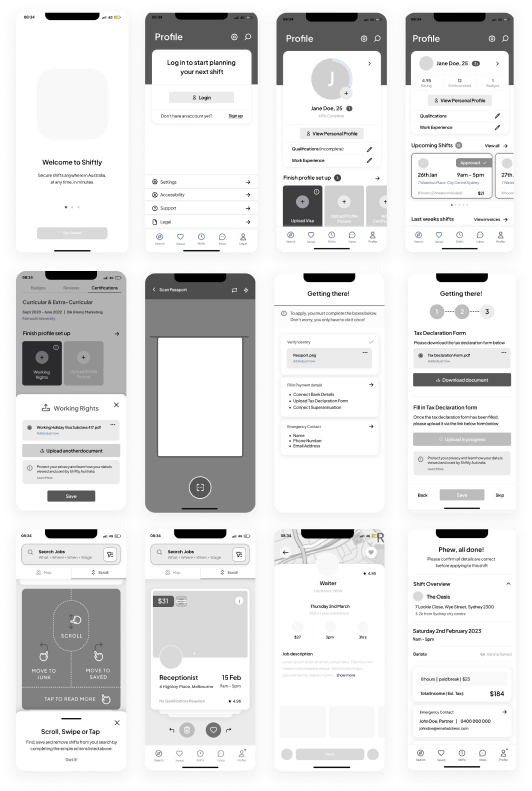
As the information architecture began to take place, I preferred visualising the flows through wireframes to bring the journey to life, and ideate further features that may be required. I would build a flow, and try to usability test this to maintain the project’s momentum.

Image

Usability Testing

Usability testing was instrumental in uncovering additional features desired by users. By viewing the designs firsthand, users could more vividly envision their journey, leading to insightful suggestions, allowing me to pinpoint shortcomings in the high-fidelity wireframes leading to a more refined and user-centric design.


  1. • 70% of the users hated the thought of onboarding all in one go, they preferred the idea of completing profile set up in stages.

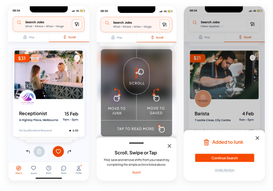
  2. • 100% of our users didn’t recognise the card swiping on job-search page, so I introduced a pop up demonstrating how the cards can scroll, swipe left for junk and swipe right to save to speed up their search.

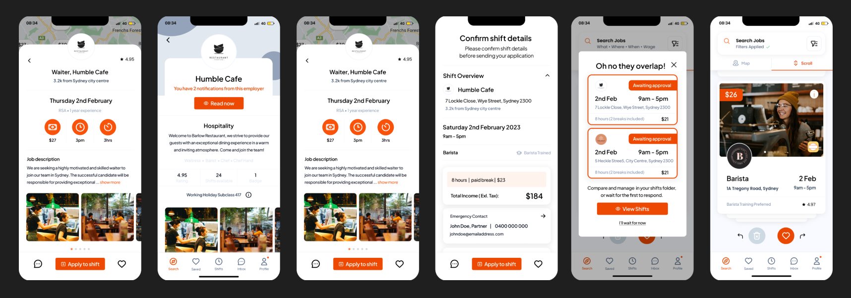
  3. • Some of our users felt uncertain pressing the ‘apply’ button with out reviewing their details and shift information first. So i incorporated a ‘Shift overview’ page which gives users a glance of a shift, and opportunity to cancel before applying
Image
Project Outcomes

primary features

Enhanced user flow through simplified interactions: Effortlessly dismiss unsuitable roles with a left swipe, shortlist potential matches with a right swipe, tap to explore job details more thoroughly and the traditional scrolling feature conveniently postpones interactions.

Image

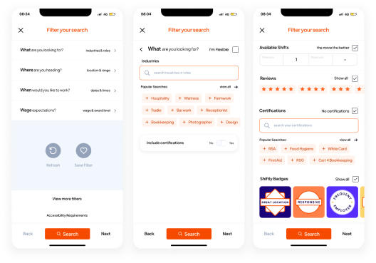
Primary filters accelerate your search experience with four essential criteria: location, timing, job type, and salary range. While secondary filters customise your search.

Image

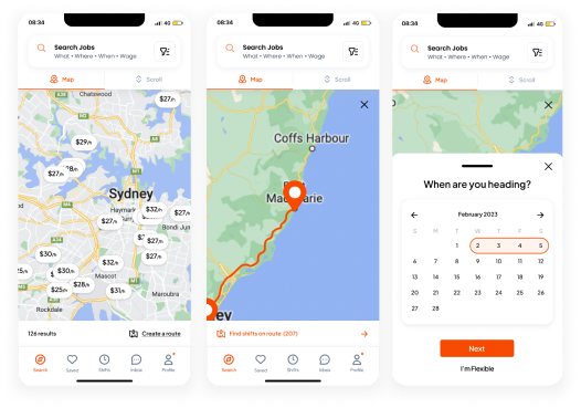
Map search and route filters allow you to efficiently plan trips around prominent shift hotspots.

Image

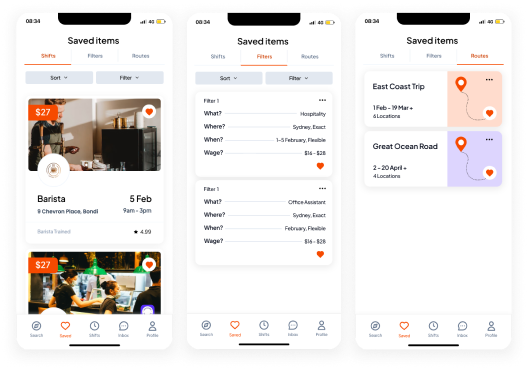
The save shifts, filters and routes features allow you to effortlessly resume where you left off, minimising time spend on inputs.

Image

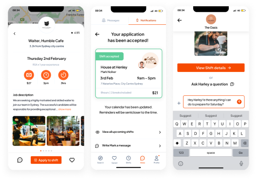
Swift application processes encourage reduced response times, enhancing communication with potential employers for a more efficient job search journey.

Image

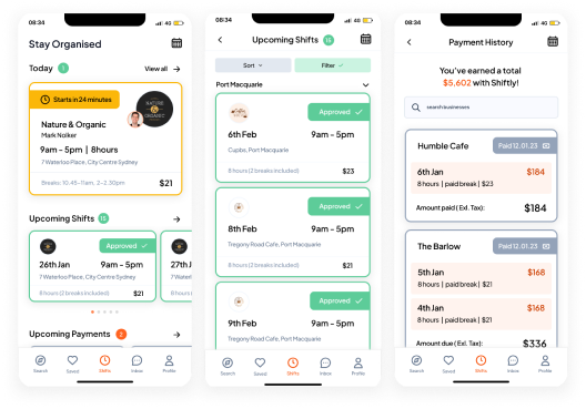
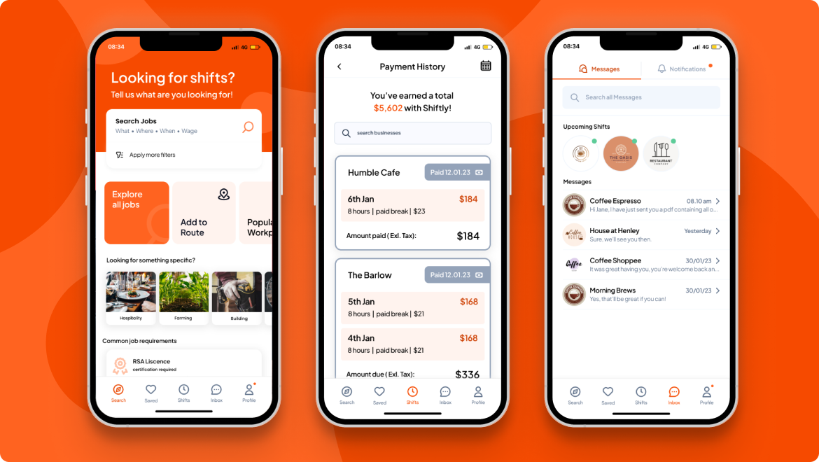
upcoming shifts and potential earnings consolidated in one place enables you to stay organised and maintain a clear overview of your applications and schedules, streamlining your planning process and enhancing productivity.

Image

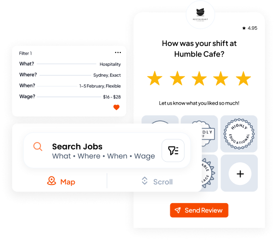
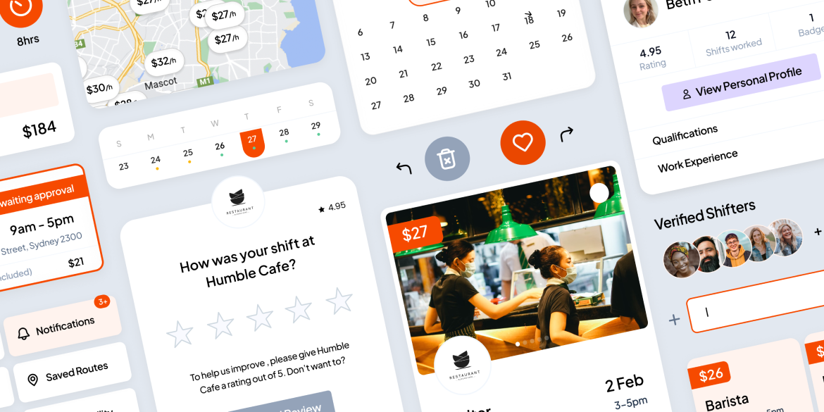
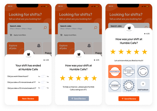
The rating system and transparent record of shift history eliminates the need for extensive cover letters and CVs, building a trusted community of employers and employees. This not only simplifies the application process but also builds a credible platform for both job seekers and employers.

Image